Logo
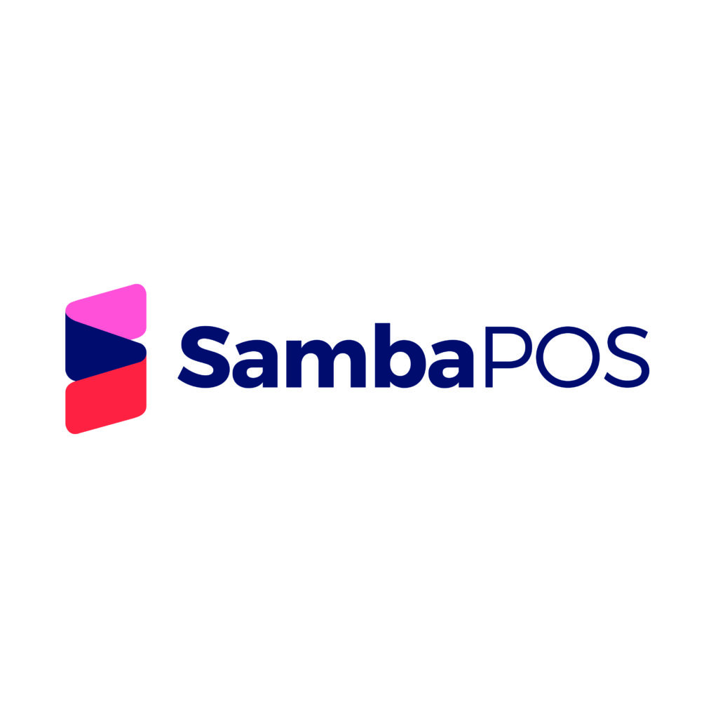
The SambaPOS emblem was prepared by inipiring from the order receipts of the POS printer. An order slip that extend exponentially and forms the letter S is represented by graphically combining 3 cards placed in a vertical perspective. The colors used are dynamic, humane and consist of warm tones that reflect the Mediterranean culture. These tones also form a connection point to the meaning of the name “Samba” and its Spanish / Portuguese origins.
Sub-Brands
SambaPOS sub-brand icons are created on the flat form without angle of the card floors in the main logo, by adding the sub-brand name initials to the left and a simple iconic expression to the right. Icon colors can be derived from different colors from the corporate color palette. The font must be derived from the main logo format.
Colors
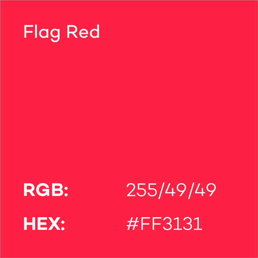
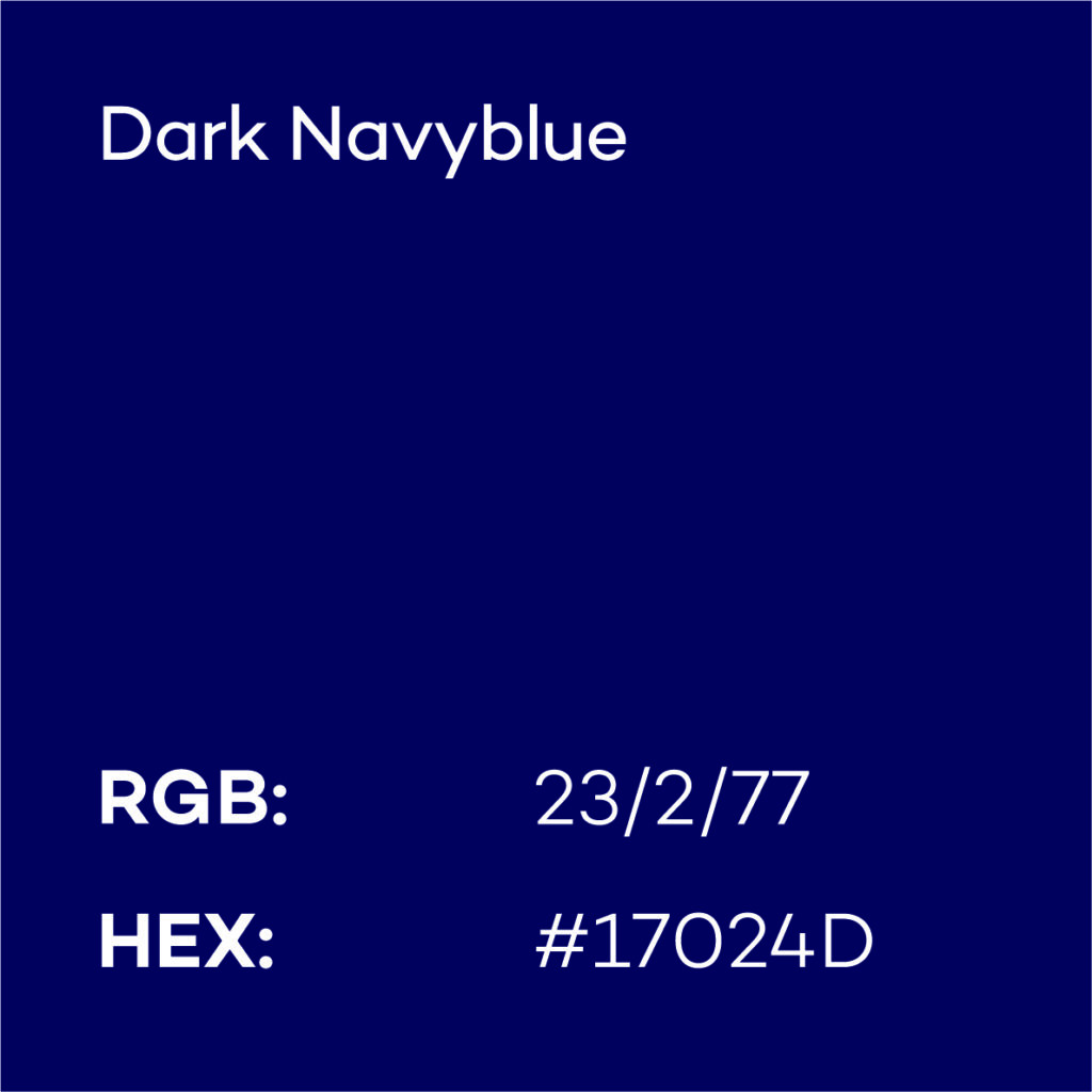
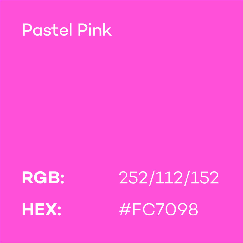
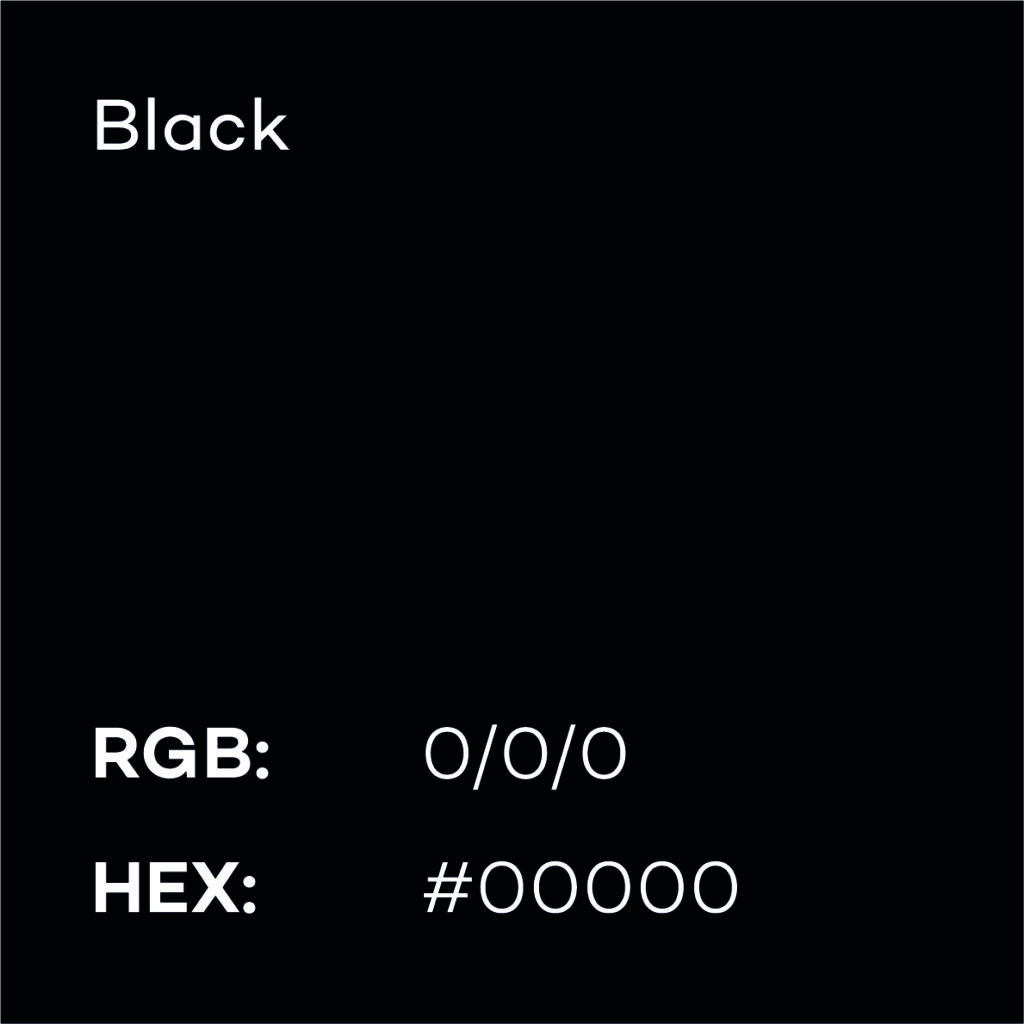
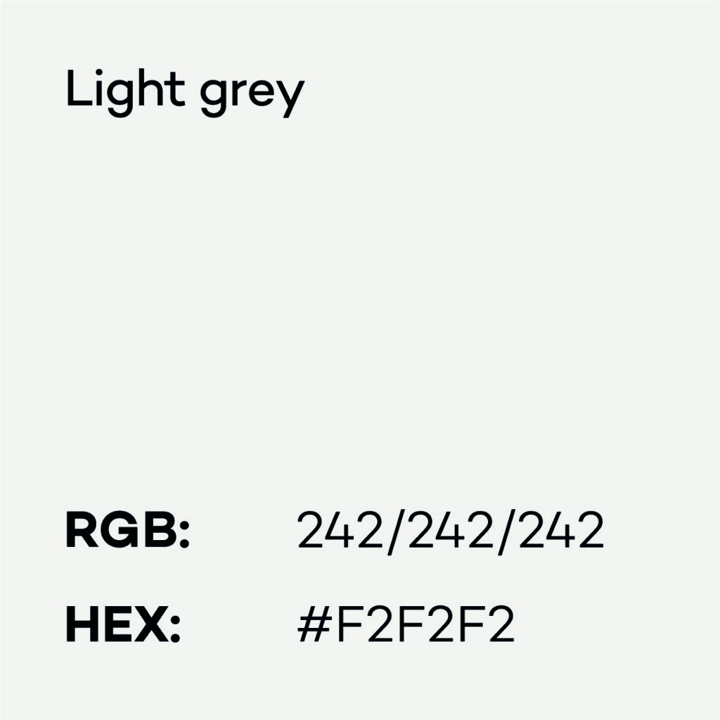
SambaPOS Colors / Digital Usages
Primary Colors
Auxility Colors
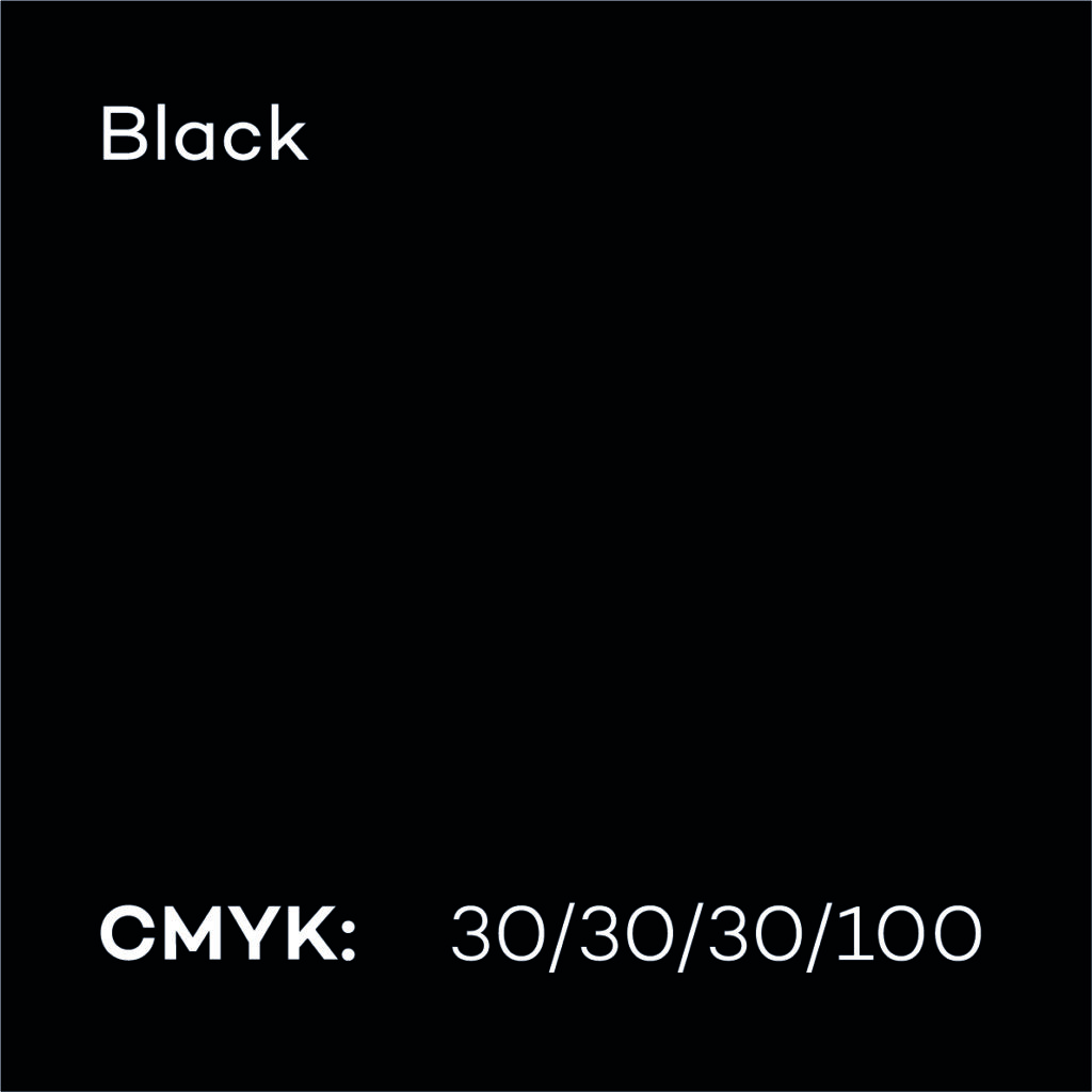
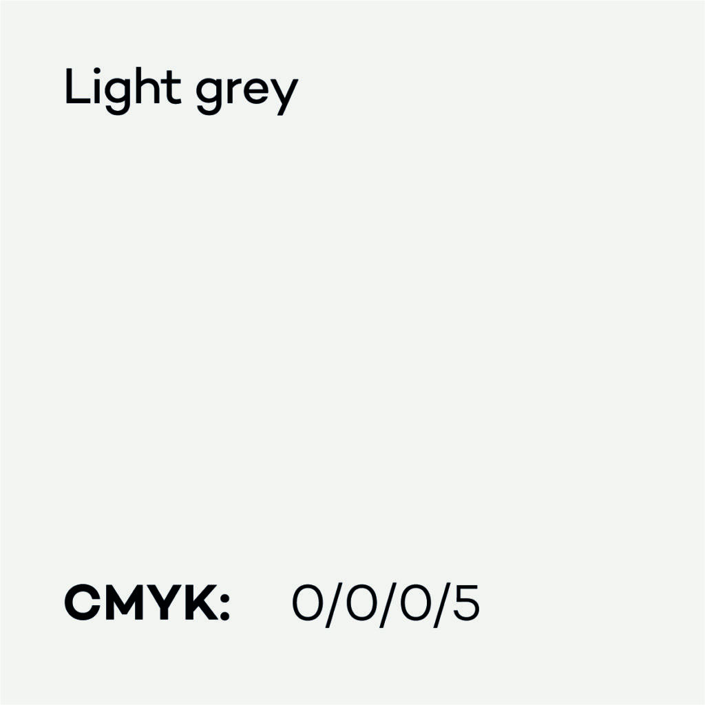
SambaPOS Colors / Printed Uses
Primary Colors
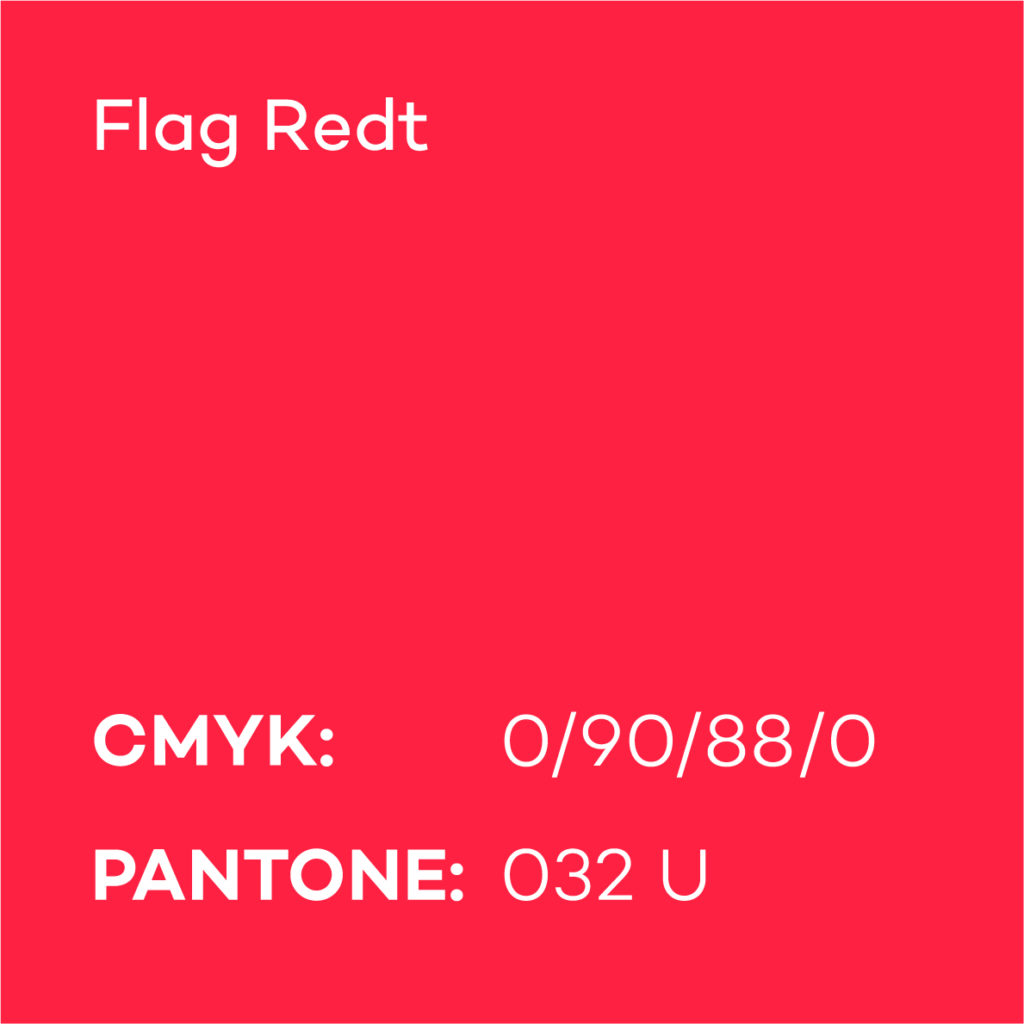

Auxility Colors

Fonts
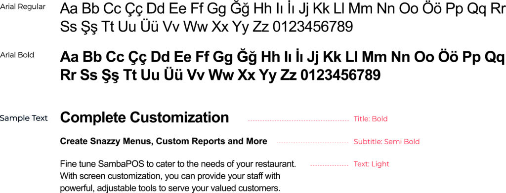
Montserrat
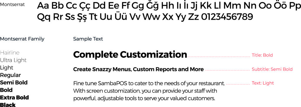
Safe Usage for Powerpoint and Word Documents
Arial
